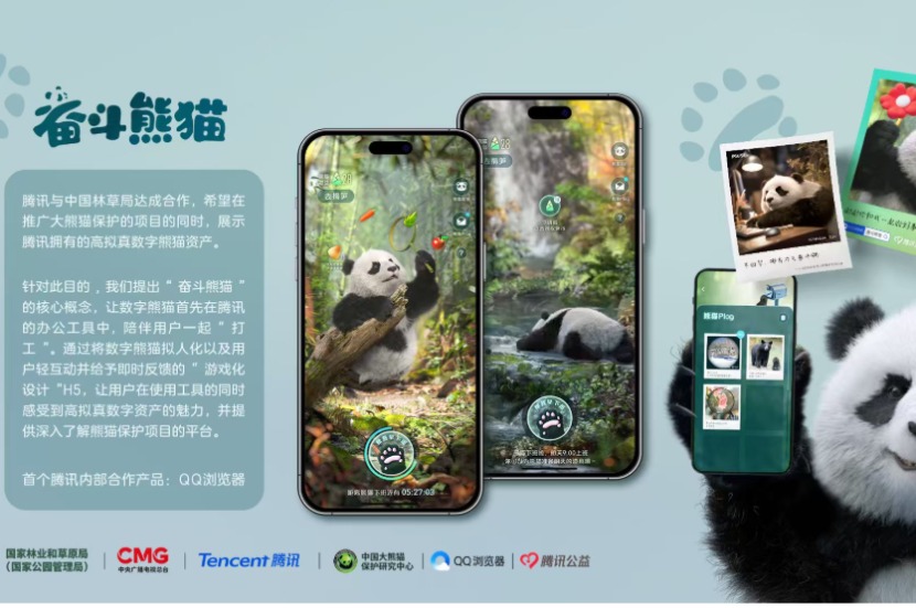
Awards : Future Award 未来奖
Category : Digital Design(Brand) 数字设计(品牌组)
Designer : 回头是岸设计(广州)科技有限公司
This is a typography design exhibition themed "Motion & Graphic Typography", which aims to explore the boundaries of font design, demonstrate the role of dynamic and static typography in contemporary visual communication, and actively advocate for an open and diverse Chinese character ecosystem. The visual identity we designed for it not only reflects the cultural inheritance and promotion of Chinese characters but also represents a proactive exploration of future trends in typeface design. The visual creativity originates from the "handwriting input method" on screen-based terminals such as "smartphones." The handwriting process of the four Chinese characters in the exhibition theme, "动静字如", is dynamically presented in the main visual poster. The act of "handwriting input" is dynamic—a writing process approaching the correct character formation, during which changing "pictographic associative words" intuitively reveal the characteristics of Chinese characters as hieroglyphs. In contrast, the "screen output" process is relatively static, representing the machine’s capture and translation of handwriting. The typeset result output by the screen font library is precise, with predefined and specific letter-spacing and line-spacing. The writing trajectory of human "handwriting" on screen-based terminals appears more hesitant and rustic compared to traditional "paper media". To ensure the authenticity of "contemporary screen-based writing", we invited a child who has just learned to write, Ou Jiayu (6 years old), to create the handwritten characters for the exhibition’s visual identity by writing with her finger on an iPad. Starting from the characters, the "handwriting input" and "screen output" correspond to "Motion" and "Graphic (Static)", respectively, showcasing both the "pictographic beauty" of Chinese characters and the "rustic charm" of contemporary screen-based writing.
这是一场以“动静字如”为主题的文字设计展,旨在探究字体设计的界限,展示动态和静态字体在当代视觉传达中的作用,并积极倡导开放、多元的汉字生态系统。这是我们为其设计的展览视觉形象,不仅是对汉字文化传承与发扬的体现,更是对未来字体设计发展趋势的积极探索。 视觉创意源自“手机”等屏显终端的“手写输入法”,将展览主题“动静字如”四字的手写输入过程呈现在主形象动态海报中。“手写输入”的过程是动态的,是趋近于正确文字结果的书写过程,过程中会有变化的“手写象形联想词”,直观地呈现汉字作为“象形文字”的特点。“屏显输出”的过程相对而言是静态的,是机器对于手写字的捕捉与转译,屏显字库字体输出的排印结果也是精密的,有预设且特定的字间距与行距等。 人为的“手写”在“屏显终端”的书写轨迹相对于传统“纸质媒介”而言是顿挫且质朴的,为了保证“当代屏显书写”的真实性,我们邀请到刚刚学会写字的区嘉瑜(6岁)小朋友为本次展览视觉进行文字书写创作,通过在iPad上用手指头进行书写来得到手写体。 从文字出发,通过“手写输入”与“屏显输出”来对应表达“动”与“静”,展现汉字的“象形之美”与当代屏显书写的“质朴趣味”。